
Giving fleet managers a real, ongoing view into a driver safety program they'd previously only heard about in meetings.
Geotab Vitality is Geotab's driver engagement add-on, built on top of its core telematics platform. It takes real driving data and turns it into something drivers actually want to engage with, setting personalized goals, tracking progress, and rewarding improvement with things like coffee or gift cards, so safe driving starts to feel less like a rule and more like a game worth playing.
A few things to start with:
Vitality already drove a 15% improvement in driver behaviour within a driver's first 30 days. The goal of this project was giving fleet managers visibility into that value.
Onboarding shipped July 27, 2026 and is the first phase of a rollout that's still ongoing.
The project
Business problem
The Vitality team was spending a lot of time manually building custom reports and slide decks for every fleet and every check in meeting. This was a process that didn't scale as more fleets joined the program, and pulled resources away from other sections.
Business need
Broaden the platforms reach and cater to different fleet sizes and lessen the strain on the customer compliance department.
User problem
The driver side of this was already working. But the people paying for the program, fleet managers, had no way to actually see it working.
If a manager wanted to know how their program was doing, they had to wait for a scheduled meeting where someone from the Vitality team would walk them through a slide deck. Want an update outside of that? You'd have to email someone and wait.
User need
Have an all in one platform with broken down outputs from the program that they could view at any time.
The challenge
Fleet managers only found out how their program was performing through scheduled meetings with the Vitality team, who'd walk them through a slide deck. If they wanted an update outside of that, they had to reach out directly or wait for the next session.
This left managers without on-demand visibility into their own program, while the Vitality team spent significant time manually building custom reporting for every fleet — a process that would only get harder as more fleets joined.
Discovery
Talking to the Vitality team, it became clear early on that the issue wasn't just "there's no dashboard." It was that neither side had a scalable way to share or access this information. Managers were locked out of their own data, and the Vitality team was stuck in manual reporting that only got harder as more fleets joined.
But knowing that wasn't enough. We still didn't know if the MVP as it existed would actually fix any of it. So, we worked through it in stages, starting with what managers were actually trying to get done, then digging into how the Vitality team's own systems worked behind the scenes to see where the manual effort was coming from.
Our users


What existed
Early findings
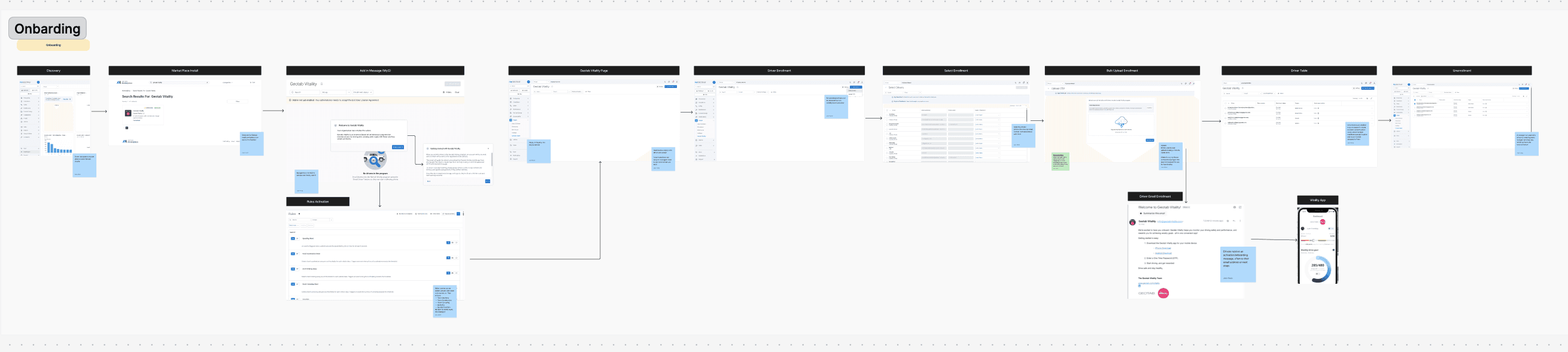
- There was no clear onboarding path for users in the system
- The flow for set-up was very disjointed- users had to jump from page to page to get results
- Users had no reason to return here, unless they were making updates for their drivers
- Keeping track of enrolled drivers was manual and messy
- Managers had no fast way to understand how their program was doing overall
The workshop
To validate if our MVP would actually solve the problem, I led a multi-step workshop with Vitality team members across product and marketing. We structured the sessions around five focus areas:
User stories
Mapping what fleet managers were actually trying to accomplish.
Backend process
Mapped how the Vitality team's internal systems and processes worked, to understand their workflow and pinpoint the manual effort.
Pain point writing
Writing out both user pain points and Vitality team's pain points.
Pain point categorization
Mapping each pain point against the existing MVP sections, to see what was addressed, what wasn't and where the MVP might need to be adjusted.
Quadrant mapping
To prioritize what to solve first, plotted the pain points mapped on the MVP by complexity vs. impact.

Quadrant map- helped to inform our phase 1 priorities
Analysis
Key insights mapped to the MVP
Managers had no quick way to understand overall program performance without digging through multiple pages or waiting on the Vitality team.
A high-level home screen surfacing key trends like engagement, safety improvements, and reward usage at a glance.
Managing driver enrollment was manual and hard to track, especially for fleets with large or frequently changing staff.
A dedicated section to add, remove, and update drivers, assign them to depots, and track participation status.
Managers had no visibility into whether the program was worth the investment, or which drivers needed more support.
Tracks goal achievement, rewards earned and redeemed, and engagement trends to help managers assess ROI.
Data access needed to be controlled across different roles and fleets.
Lets managers manage who has access to what, and toggle features on or off at the driver or fleet level.
Fleet teams needed a way to get up to speed on the program and stay engaged with it long term.
A resource library with videos, PDFs, and assignments managers can push to drivers and track completion on.
ideation- UX THINKING
Guided by the workshop insights, I structured how the dashboard would work. This included creating an information architecture diagram. A few core principles shaped every decision:
Give managers clarity (trust)
A manager should know if the program is working without digging for it.
Two levels of detail
the big picture, and the ability to drill down when needed.
Less friction
Fewer clicks between a manager and the answer they need.

The whole thing was built around top-level navigation tabs, so managers could move between sections without relearning the layout every time something new got added. That mattered a lot here because this wasn't meant to be a one-and-done release.
Task flow

Solutions
This project came down to two main pieces: getting managers onboarded quickly, and building out the full Vitality platform experience.
Onboarding
Onboarding was one of the biggest asks for this project, since it was a brand-new experience for fleet managers. The goal was to get managers to values and outputs in as few clicks as possible, without overwhelming them with the full dashboard on day one.
I spent time in Mobbin looking at how other products handled onboarding, then created a step-by-step flow with one step introduced at a time instead of everything at once.


Geotab Vitality pages
The experience was organized into some key pages.
A dashboard gave managers a quick overview they could drill into for more detail.
A driver page let them view and manage enrollment (adding, updating, or removing drivers).
A performance page showed how enrolled drivers were progressing over time through data visualization.
An engagement page that broke down how drivers were engaging with the app and progressing.
A rewards page that highlighted the rewards partners- broken down into the partners and cumulative credits spend on each one.
Resources that directed users to different links that housed Geotab Vitality information and resources.
A reports page were users could view their ROI and download necessary files (exportable version of the old slide decks the Vitality team used to build manually).
These pages gave managers full visibility into the program, covering things like driver credits, partner rewards, and driver improvement, while also letting them take action rather than just observe.
Data visualization
Since so much of this lived in performance breakdowns, the charts themselves carried a lot of weight. I kept coming back to two things: keep it scannable at a glance, and make sure trends over time were obvious, so a manager could tell if things were improving, flat, or slipping, without needing to dig into raw numbers.

Initial design of the Rewards and Engagement page
Feedback
Feedback didn't stop after the first round. I kept iterating with product, dev, and design throughout the whole process.

Final design of the Rewards page (ungrouped from Engagement)
final
Where it's at now
This was a large project for a small team, so rather than launching everything at once, the designs were built out and released in phases. Onboarding was the first to ship, since it was the newest, not just for users, but for the Vitality platform as a whole.
As of today, onboarding's gone live. It's still early so there's no usage data to share yet, but we're defining what to track as the rollout continues, things like onboarding completion rate and how much ad-hoc reporting requests drop off as managers get self-serve access. The driver and performance pages are already next in line.


What I took away
Don't wait for answers to show up on their own
Running the workshops early, user stories, backend process, pain point mapping, helped to not guess at what the MVP actually needed. If I'd waited for answers to show up on its own, we would have designed against assumptions instead of real gaps.
New territory means a lot of iteration
This was Vitality's first onboarding experience ever, so there was nothing internal to lean on. Staying close to the team and being okay with shipping in phases kept things moving.
Streamlining doesn't mean losing depth
Mapping pain points against the MVP proved that. Some sections got simplified or cut entirely, and the experience remained clear.
Advocate for the user
Talking through the reasoning behind a design decision, and pushing for what the user actually needs I believe made a huge difference in this project.
Next project