




Role
Lead designer/owner
Team
2 PMs
7 Developers
1 Designer
Duration
Jan 2026-Aug 2026
Status
Shipped
Overview
When a truck driver runs a red light, or a delivery van clips a parked car, or a fleet vehicle causes an incident, that story used to live in a dozen different places before Investigations. Speed here. GPS there. Braking data somewhere else. Video, if you could find it.
Investigations lets fleet users pull all of that together into one place, mapping out what happened, where, who was involved, and which vehicle, so they can actually see and understand the incident instead of just having raw data for it. Once the case is built, it exports as a PDF report.
This case study covers my work on the case-building and PDF export experience, plus a few related Investigations tasks along the way.
A few things to start with
Fleets using dash cam/telematics evidence are 40% more likely to win liability claims (AAA). While clear evidence fast tracks settlements by 35%. So this project wasn't just about usability but delved into legal and financial outcomes for users.
Rollout was continuously ongoing and began in October 2025 (led by a previous designer), the designs that I led were shipped out in July/August 2026.
THE PROJECT
Business need
Give users a self-serve way to compile and export incident evidence and reduce the burden of manually pulling data from different sources.
Business problem
Fleets already had the raw data investigators, adjusters, and lawyers needed after an incident. What they didn't have was a structured way to build that data into an actual case, or a way to package it for people outside the MyG ecosystem entirely.
User problem
When an incident happened, MyG technically had everything a user needed, it was just scattered across a dozen pages. And the data's importance shifted case by case: what mattered for one incident wasn't what mattered for the next. Pulling it together into something usable was manual, slow, and easy to get wrong, in a situation where time to action genuinely mattered.
User need
Have an all in one system that houses in the investigations information along with an exportable view that was easy to use, transparent and accurate.
Where I came into this
By the time I joined, the early designs and core interactions for Investigations already existed, discovery and the foundational solution had been done by a previous designer. My job was refinement: iterating on what existed and writing new specs, specifically for the flow from download button to final PDF file.
That said, the work didn't stay contained to just that. A handful of other Investigations tasks ended up on my plate too, so I'll touch on those as they come up.
Getting caught up…quickly
Coming in mid-project, my first job wasn't designing, it was understanding.
I learnt about the system constraints pretty early on.
I'd put together a design and already reviewed it with my PM. Then I sat down with engineering to walk through it, and the response was immediate: the system, as it existed, couldn't support what I'd designed.
Before getting into what happened next, let me explain how I got to that meeting in the first place.
"This can't be built"
BACKGROUND
I understood the user. I had a rough idea of what the solution needed to do. What I didn't understand yet was what was actually stopping the PDF solution from being built, so that became the next thing to figure out.
Early conversations with my PM surfaced the real issue that there were significant technical constraints tied specifically to the PDF download itself. Understanding that, I started digging in on my own, using Claude to research other download streams that weren't really a PDF approach.
01
02
03
Html to image
Converts the on-screen content directly into an image file (PNG/JPG), preserving the exact visual layout. Quick to generate and easy to share, but loses interactivity and text searchability.
Separate wedpage
Publishes the content to a standalone, shareable web page with its own URL. Keeps content interactive and easy to update, and works well for sharing links instead of files.
Screen grab download
Lets users manually capture their current view and save it locally. Simple and familiar, but relies on manual action and may not capture content outside the visible viewport.
Coming Back With Options, Not Just Questions
Needing dev input on the feasibility of any of these alternate download streams, I didn't want to walk into that next meeting empty handed again. So instead of just bringing questions, I put together a design around the strongest option from my research. Partly because it gave the team something concrete to react to, and partly because it helps me to think out loud when I have a visual to point at rather than describing an idea in the abstract.
discovery
Outputs
Design the PDF export flow from the download button to the final export file that users receive once the download is completed. However, through my time with the team more needed to be done with the designs so I some of those tasks will be sprinkled throughout this case study since it was all under investigations.
Our users


What existed
Early findings
- There was no clear onboarding path for users in the system
- The flow for set-up was very disjointed- users had to jump from page to page to get results
- Users had no reason to return here, unless they were making updates for their drivers
- Keeping track of enrolled drivers was manual and messy
- Managers had no fast way to understand how their program was doing overall
The workshop
To validate if our MVP would actually solve the problem, I led a multi-step workshop with Vitality team members across product and marketing. We structured the sessions around five focus areas:
User stories
Mapping what fleet managers were actually trying to accomplish.
Backend process
Mapped how the Vitality team's internal systems and processes worked, to understand their workflow and pinpoint the manual effort.
Pain point writing
Writing out both user pain points and Vitality team's pain points.
Pain point categorization
Mapping each pain point against the existing MVP sections, to see what was addressed, what wasn't and where the MVP might need to be adjusted.
Quadrant mapping
To prioritize what to solve first, plotted the pain points mapped on the MVP by complexity vs. impact.

Quadrant map- helped to inform our phase 1 priorities
Analysis
Key insights mapped to the MVP
Managers had no quick way to understand overall program performance without digging through multiple pages or waiting on the Vitality team.
A high-level home screen surfacing key trends like engagement, safety improvements, and reward usage at a glance.
Managing driver enrollment was manual and hard to track, especially for fleets with large or frequently changing staff.
A dedicated section to add, remove, and update drivers, assign them to depots, and track participation status.
Managers had no visibility into whether the program was worth the investment, or which drivers needed more support.
Tracks goal achievement, rewards earned and redeemed, and engagement trends to help managers assess ROI.
Data access needed to be controlled across different roles and fleets.
Lets managers manage who has access to what, and toggle features on or off at the driver or fleet level.
Fleet teams needed a way to get up to speed on the program and stay engaged with it long term.
A resource library with videos, PDFs, and assignments managers can push to drivers and track completion on.
ideation- UX THINKING
Guided by the workshop insights, I structured how the dashboard would work. This included creating an information architecture diagram. A few core principles shaped every decision:
Give managers clarity (trust)
A manager should know if the program is working without digging for it.
Two levels of detail
the big picture, and the ability to drill down when needed.
Less friction
Fewer clicks between a manager and the answer they need.

The whole thing was built around top-level navigation tabs, so managers could move between sections without relearning the layout every time something new got added. That mattered a lot here because this wasn't meant to be a one-and-done release.
Task flow

Solutions
This project came down to two main pieces: getting managers onboarded quickly, and building out the full Vitality platform experience.
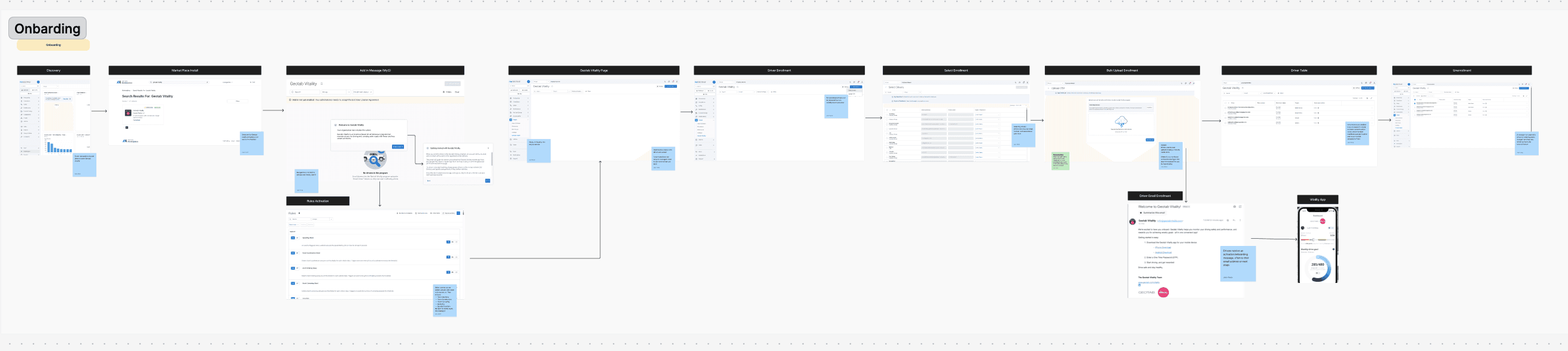
Onboarding
Onboarding was one of the biggest asks for this project, since it was a brand-new experience for fleet managers. The goal was to get managers to values and outputs in as few clicks as possible, without overwhelming them with the full dashboard on day one.
I spent time in Mobbin looking at how other products handled onboarding, then created a step-by-step flow with one step introduced at a time instead of everything at once.


Geotab Vitality pages
The experience was organized into some key pages.
A dashboard gave managers a quick overview they could drill into for more detail.
A driver page let them view and manage enrollment (adding, updating, or removing drivers).
A performance page showed how enrolled drivers were progressing over time through data visualization.
An engagement page that broke down how drivers were engaging with the app and progressing.
A rewards page that highlighted the rewards partners- broken down into the partners and cumulative credits spend on each one.
Resources that directed users to different links that housed Geotab Vitality information and resources.
A reports page were users could view their ROI and download necessary files (exportable version of the old slide decks the Vitality team used to build manually).
These pages gave managers full visibility into the program, covering things like driver credits, partner rewards, and driver improvement, while also letting them take action rather than just observe.
Data visualization
Since so much of this lived in performance breakdowns, the charts themselves carried a lot of weight. I kept coming back to two things: keep it scannable at a glance, and make sure trends over time were obvious, so a manager could tell if things were improving, flat, or slipping, without needing to dig into raw numbers.

Initial design of the Rewards and Engagement page
Feedback
Feedback didn't stop after the first round. I kept iterating with product, dev, and design throughout the whole process.

Final design of the Rewards page (ungrouped from Engagement)
final
Where it's at now
This was a large project for a small team, so rather than launching everything at once, the designs were built out and released in phases. Onboarding was the first to ship, since it was the newest, not just for users, but for the Vitality platform as a whole.
As of today, onboarding's gone live. It's still early so there's no usage data to share yet, but we're defining what to track as the rollout continues, things like onboarding completion rate and how much ad-hoc reporting requests drop off as managers get self-serve access. The driver and performance pages are already next in line.

Geotab Vitality Overview homepage

Geotab Vitality Performance page
What I took away
Don't wait for answers to show up on their own
Running the workshops early, user stories, backend process, pain point mapping, helped to not guess at what the MVP actually needed. If I'd waited for answers to show up on its own, we would have designed against assumptions instead of real gaps.
New territory means a lot of iteration
This was Vitality's first onboarding experience ever, so there was nothing internal to lean on. Staying close to the team and being okay with shipping in phases kept things moving.
Streamlining doesn't mean losing depth
Mapping pain points against the MVP proved that. Some sections got simplified or cut entirely, and the experience remained clear.
Advocate for the user
Talking through the reasoning behind a design decision, and pushing for what the user actually needs I believe made a huge difference in this project.
Next project